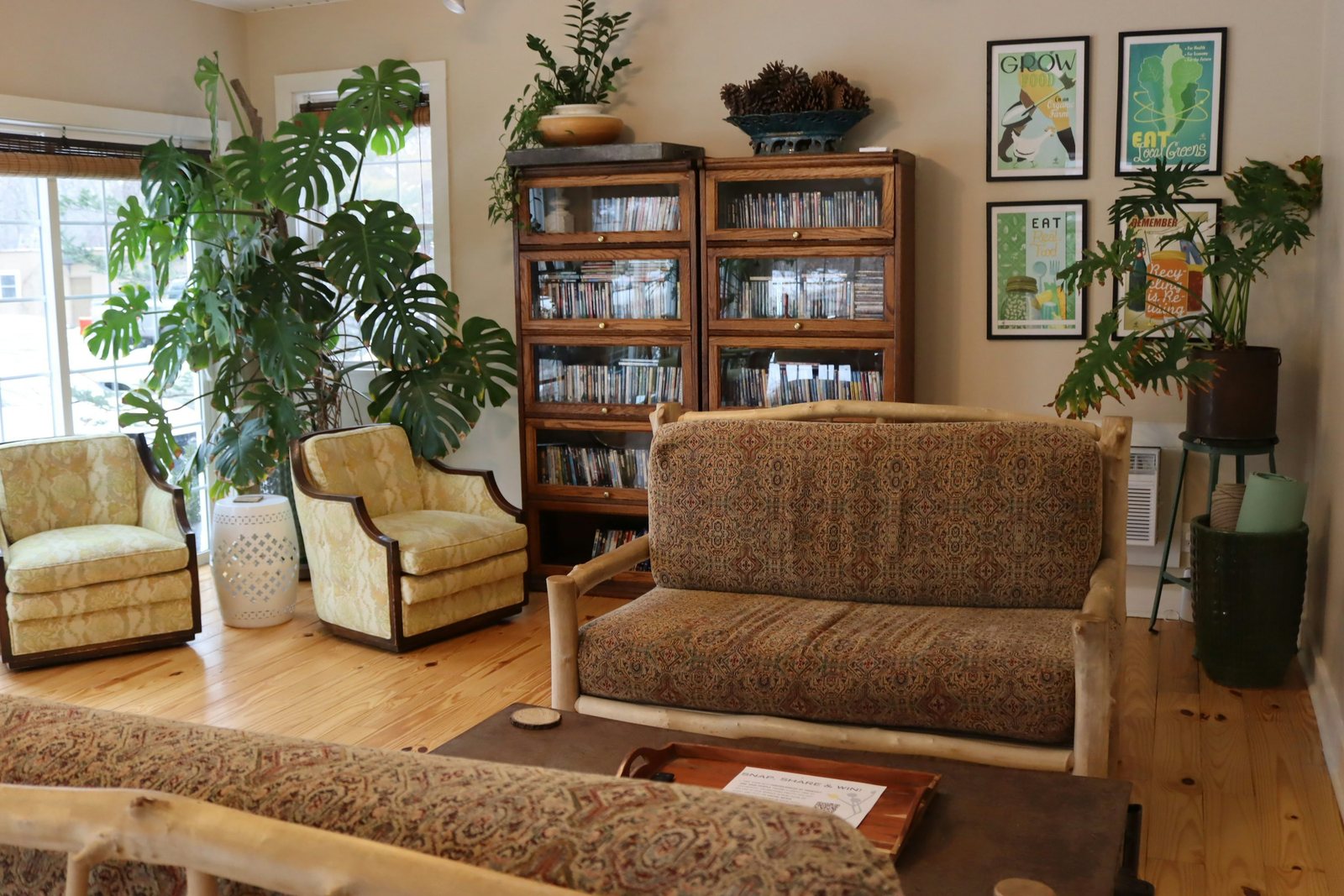
The awkward part of choosing colors for a rental is that somebody has already chosen half of them. Your floor might be orange-toned wood, the walls a creamy white, and the kitchen visible from the sofa a cool gray. A palette that looks convincing on a screen can fall apart beside those surfaces. This workshop starts with what stays, then gives the things you bring into the room a specific job.
A FEW THINGS TO TAKE WITH YOU
- Treat large fixed finishes as active colors, even when they are called neutral.
- Choose one connecting color before collecting several accent colors.
- Judge samples beside the actual finishes in daylight and your usual evening light.
The room already has a palette
Make two columns on paper: staying and movable. Put flooring, cabinetry, tile, window frames, and any paint you cannot alter in the first. Put your sofa, bedding, curtains, art, and smaller belongings in the second. Include a supplied sofa in the staying column if it must remain. This prevents a plan that quietly depends on replacing the most expensive object in the room.
Describe each large surface in ordinary words rather than trying to diagnose a precise undertone. Cream, reddish brown, pale gray, and almost black are enough to begin. If two surfaces look different, record the difference. Calling everything beige makes it harder to understand why a new beige cushion seems unrelated to its surroundings.
Pick the finish that gets the most attention
Stand at the doorway and sit in your usual seat. Which fixed surface occupies the most visual space from those positions? A floor can dominate an empty room but become less prominent once furniture is in place. A small tiled backsplash may matter more if you face it all day from your desk. Start with the finish you repeatedly notice, rather than automatically using the wall color.
You have three useful responses: echo it, soften the contrast around it, or give your attention another destination. Echoing does not require an exact match. A warm brown floor might connect with a rust detail in a print. Softening might mean choosing cream rather than stark white textiles. Redirecting might mean a favorite artwork beside a quiet sofa. These are choices to test, not rules that every room must follow.
Give three colors different jobs
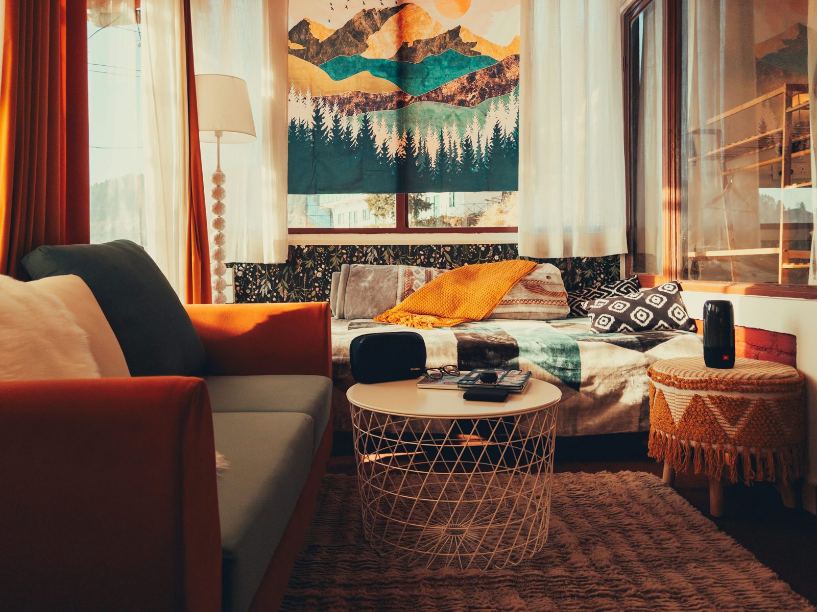
Build a small working palette with a background, a connector, and an accent. The background is a color you can tolerate across a relatively large movable surface. The connector belongs comfortably beside both a fixed finish and something you own. The accent is the part you can change easily when your taste shifts. One existing fabric or artwork may supply all three.
Avoid treating this as a shopping list. If your gray sofa supplies the background and a patterned blanket already connects gray with brown, the room may only need that blanket moved into view. A palette is useful when it reduces decisions; it becomes a burden when every useful object needs replacing to comply with it.
| Color job | Question to answer | Possible place to use it |
|---|---|---|
| Background | What can sit beside the largest fixed finish comfortably? | Existing sofa, bedcover, or curtains |
| Connector | What relates to two colors already in the room? | Patterned textile, art, or wood accessory |
| Accent | What do I enjoy enough to repeat in a small amount? | Book cover, cushion, or ceramic object |
Try the method on a mixed-finish room
Imagine a rental with honey-colored flooring, off-white walls, a charcoal sofa, and a black metal table. This is an illustrative exercise, not a documented makeover. One possible direction keeps charcoal as the movable background, uses an oatmeal textile to connect with the walls, and repeats a muted ochre from an existing print near the warm floor. The black table already relates to the darker sofa; it does not need disguising.
A second direction could use green as the main accent and keep the remaining textiles close to the wall color. Neither is objectively correct. Compare what each direction requires you to acquire, what you already like, and what you would carry to another home. Reject a theoretically harmonious palette if it makes your favorite belongings feel unwelcome.
Make a sample group, not a mood board alone
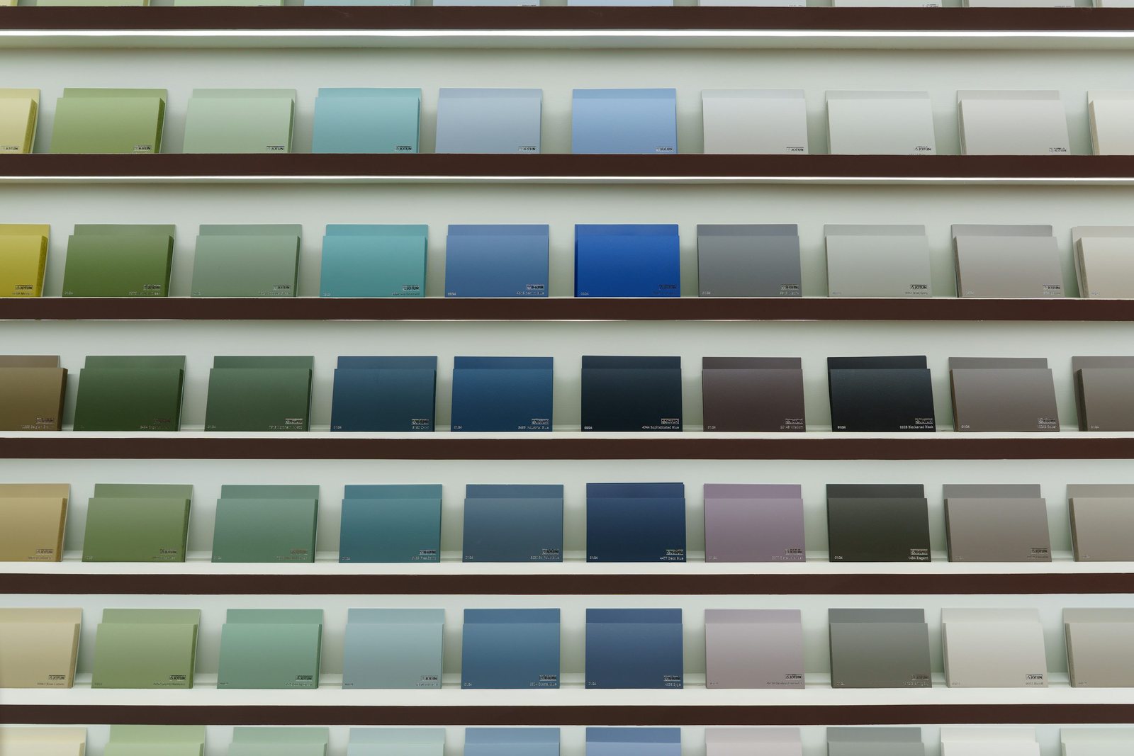
Gather actual fabrics, a book jacket, a paint card used only as a color reference, or small objects in the proposed colors. Lay them together near the fixed finish, then look from farther away. Keep samples off delicate surfaces if they could transfer color. A digital board helps organize ideas, but a photograph of a beige wall is not a reliable substitute for the wall in front of you.
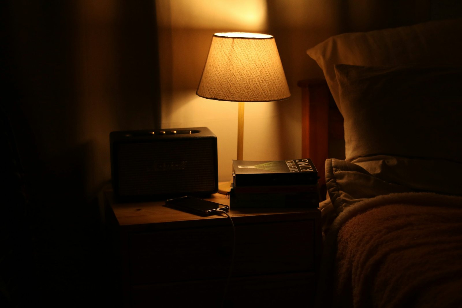
Check the group in daylight and under the lamps you normally use. Move it to the other side of the room. If one color only works in a bright corner you rarely use, reconsider its role. Make a note of the troublesome pairing rather than dismissing the whole palette; you may only need a less intense accent or a different background textile.
Keep a deliberate exception
Choose one object that does not have to match: a handmade bowl, a bright poster, or a chair you love. Place it where it can be understood as its own thing instead of surrounding it with purchases intended to justify it. This keeps the room from becoming a color exercise with nowhere for your life to go.
Finish with a short brief: the fixed finish you are working around, the three color jobs, one sample combination you liked in both lighting conditions, and what you are leaving alone. Take that brief shopping. It is more useful than a long list of fashionable color names because it remembers the actual room.
About this guide
This guide provides planning prompts and comparison criteria. It does not report product tests or results from a real household.
This guide offers general home-planning ideas. Product instructions and your own rental agreement take precedence. How we approach our guides.